By: Maggie Castle and Jaimee LaTorra
Storytelling transcends industries and is often a focus in business books, conferences, sales trainings, and much more. Storytelling, specifically as it relates to data and analytics, is a routine challenge for digital marketers. Certainly in an agency setting, we’re frequently in a position where we need to explain complex trends and data points to our clients.
We need to be good data storytellers to clearly and concisely convey why our clients should continue to invest in our services to continue to grow. So much of what we do is technical and behind-the-scenes, requiring familiarity with tech and a long attention span to grasp. This is getting increasingly difficult in the world we now live in where people have a shorter attention span than goldfish.
All of this considered, a goal group at Two Octobers gathered to answer these questions:
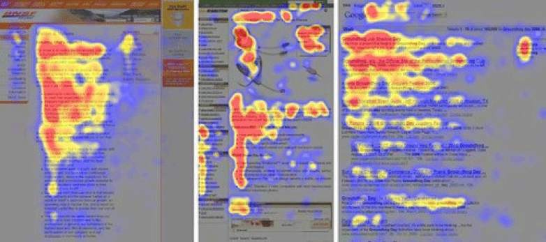
We started by conducting research to educate ourselves more thoroughly on data storytelling. We considered human behavior and psychology. For example, the use of color is scientifically proven to draw attention to patterns more effectively than callouts or size. People typically scan rather than read, and when they do, they do so in F patterns.
We explored how pre-attentive processing, the subconscious, and preconceived ways the brain filters and manages information could prevent us from successfully telling stories with data visualizations.
And lastly, we discussed how data storytelling should vary for different types of audiences. Is the recipient of our data a high-level executive, or do they like to get in the weeds?
We then scoured the Internet looking for examples of good and bad data storytelling and sat down to discuss why these worked or didn’t work. Here are a few of our favorites:
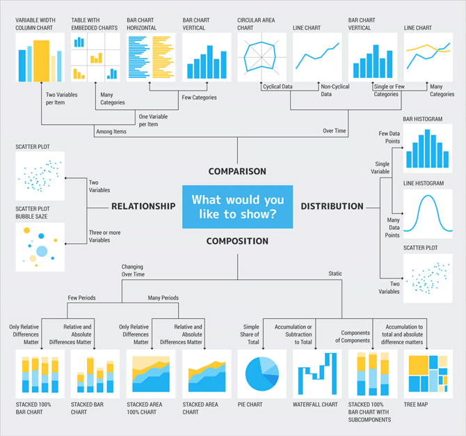
Crazy Egg does a great job of summarizing potential data storytelling visuals (how meta!) by grouping them by relationship, comparison, distribution, or composition.
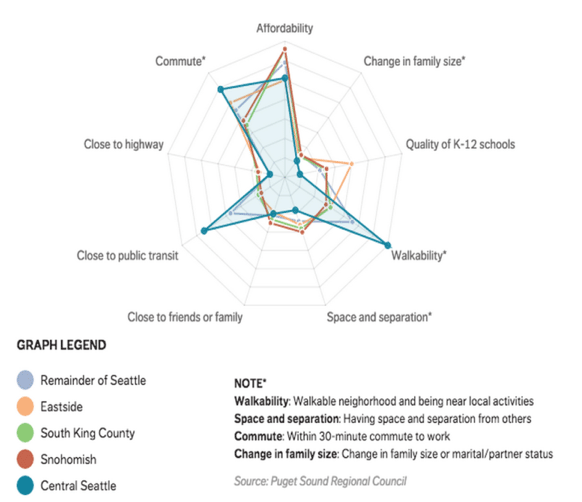
import.io showed us how Seattle Residents determine housing. In one simple graph, they clearly communicate three variables: neighborhood, amenity, and scale.
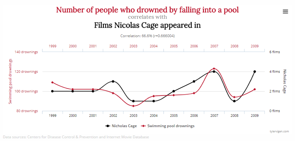
Tyler Vigen correlated the number of people who drowned in a swimming pool each year to the number of Nicolas Cage films. This example serves as an important reminder that not all correlations are meaningful. Spoiler alert: this was also the inspiration behind our data storytelling commandment ‘be honest and credible.’
Based on our research and discussions, we landed on 8 best practices or commandments for successful data storytelling.
To put these concepts to the test (and to accommodate the more competitive members of the company), we held a data storytelling contest. The rules were simple: put the commandments to work. Our hypothesis was that the best examples would demonstrate some or most of the commandments, and we were correct. By following the commandments, our data storytellers would connect with their audience (our clients) while passing on information that is important to their businesses. Below are our strongest outputs.
This example clearly highlights to a company with multiple business locations how their targeting overlaps across their different locations. This is important to the business owner because targeting overlapping locations in search campaigns can cause cannibalization of data and self-competition. As a result, this may drive up costs and hurt the ability to optimize each campaign.
We used the above map as a visual tool to demonstrate the proliferation of the problem and identify exactly which areas needed to be addressed. We found this to be more impactful and clear when explaining our reasoning for implementing the strategies listed at the bottom of the slide.
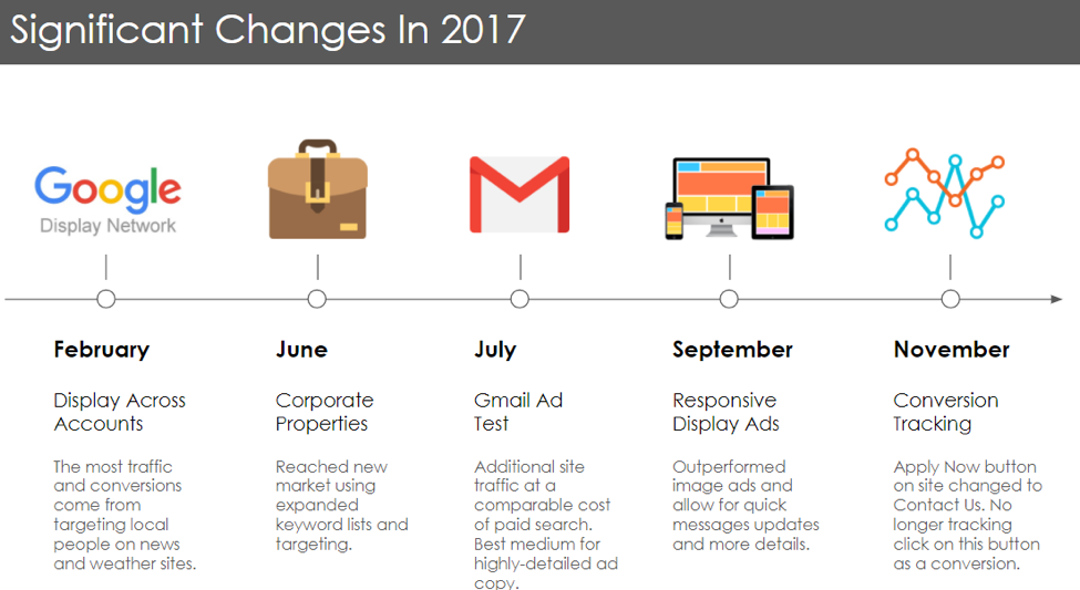
This type of information for a client report could have easily been distributed in a laundry list of bullets, but instead, it’s presented as a crisp, clean timeline. Our agency sends clients monthly reporting and it can be easy to forget about the large, impactful changes made to an account when they’re presented amidst numerous other metrics, trends, small tweaks, etc. This format gets rid of the noise and makes it easier to understand how different initiatives impacted the business and online campaigns at different points in the year. This type of context, enabled by the linear demonstration and concise text, shows the evolution of the story.
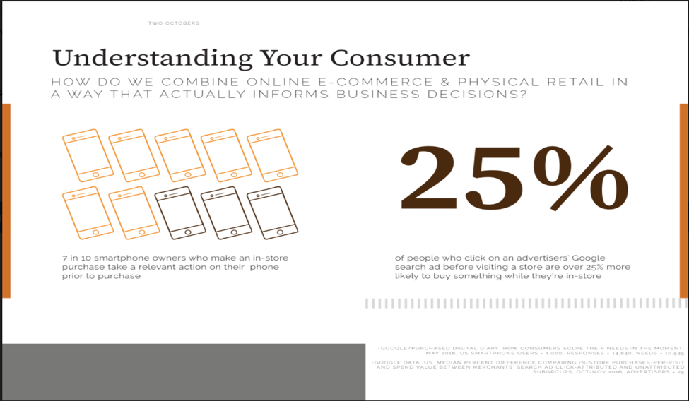
This particular example was part of a presentation illustrating the importance of tracking in-store visits. Many of our clients, and many business owners in general, struggle to merge online and offline data to create a complete picture of their consumers. Being able to explore how users discover the brand, how they stay engaged, and what leads them to finally take action can be invaluable information to have.
This slide uses some compelling statistics to examine how shoppers are using their mobile phones prior to purchase and the role Google ads play during the consideration cycle. This is an insight that business owners can consider when determining how they should be utilizing online and offline marketing efforts and the important metrics to track for each.
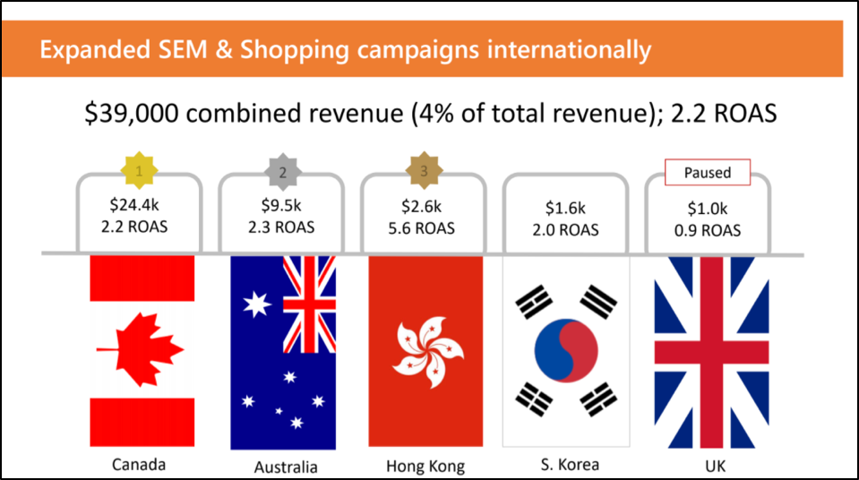
This slide does a wonderful job illustrating the performance of different geo-targets within a paid search account. It is visually compelling, drawing in users with the flags representing each country and medals as indicators of success. Beyond being aesthetically pleasing, it backs up the rankings with specific revenue and ROAS figures. Overall, this slide tells a story in a way that you wouldn’t be able to using a bulleted list.
We loved this example of data storytelling, because it incorporates a number of the commandments, most notably “provide context.” Paid search metrics vary widely between accounts based on numerous factors including geo-targeting, scope of business, quality of site and more.
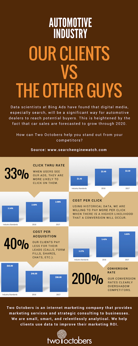
This infographic does a great job of providing context by showing the Two Octobers agency-wide metrics from the last two years compared to search industry standards. By giving a benchmark for each metric, readers can better assess the performance of Two Octobers’ automotive clients.
Your company likely has a treasure trove of raw data that can be used to make complex business decisions, illustrate the value of specific channels, and evaluate performance. However, it’s easy to get lost in the numbers without tactics and tools to distill that data into something manageable. Using these tactics to provide a humanized, compelling narrative will help turn your data into an extremely powerful communication tool.
What is your favorite example of data storytelling you have created or discovered while browsing the web? Share in the comments below or tag us on Twitter or Facebook.
Maggie Castle is a former SEM expert at Two Octobers.
Ai-user bots are visiting your website right now. Learn how you can use this data…
How do you even track visibility in AI? You can buy an expensive tool, but…
What's new in ChatGPT ads, Google Ads target CPA bidding, generative AI reporting in Search…