As an SEO consultant, I often find myself discussing user experience (UX) with my clients. This is in part because UX factors influence search engine ranking, but mostly because we measure our success in terms of engaged visitors and conversions, as opposed to ranking and clicks. As I discuss UX with a client, I often find myself telling them that their navigation is not intuitive. The problem with this assessment is that it is based on my own experiences and opinions. It is unsubstantiated. It is difficult and probably unwise to convince them to change their entire site navigation based on a hunch.
Site navigation is of particular importance to SEO because links and link text convey relevance and authority to search engines. And effective navigation leads to good user engagement, another search engine signal. Lastly, clear and intuitive navigation can mean the difference between a bounce and a business goal conversion, the ultimate purpose of any marketing activity.
I have spent a quite a bit of time over the past few years exploring UX and usability resources for ways to integrate a UX mindset, tools and processes into our SEO offering for clients. In my research, there is one tool that stands out in terms of in terms of its utility and effectiveness in demonstrating issues and opportunities to clients. That tool is Optimal Workshop’s Treejack. It is a tool that allows you to evaluate the findability of topics in a website.
The key with this tool is that the site navigation is stripped down to the skeleton of the site structure and does not allow for the influence of navigation aids and visual design.
Getting Started:
- Paths: This part of the tool allows you to get a view of the exact path someone takes in order to find certain information. With paths, you can see which pages users search on when looking for particular information, and how many times they click the back button to refine their search. This is one of the single most impactful insights I can deliver to clients. It offers a concrete visual for them to understand how intuitive (or not intuitive) their navigation is. This feature allows me to move beyond, “I have a feeling it’s not intuitive for users because . . . ” to, “I know it’s not intuitive for users because I have research participants showing us that they cannot find the information.”
Example:
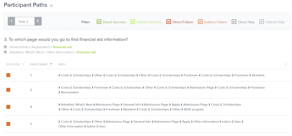
In this example, participants are given a task to find specific information on the site. The above chart shows how many clicks it took them to get to that particular location. As you can see, the information people were looking for with this task was quite hard to find. There is a lot of back and forth going on, and all of the user paths were non-linear.
Here’s another way the tool helps you identify issues and opportunities with navigation:
- First Visit Analysis: This allows you to see the first pages your test users visit while trying to complete a task, as well as the pages they visit during their sessions.
Example:
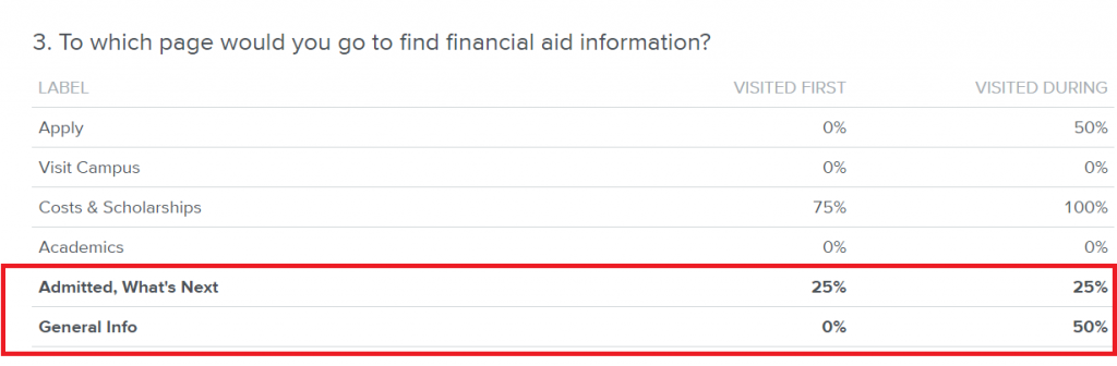
The two labels in the red box are the correct answers. Yes, plural; users have two paths from which to choose in order to get the financial aid information. 75% of survey participants started their browsing on “Costs & Scholarships”; 100% visited it during their session. However, there is no financial aid information in this section of the website. This is a pretty serious issue and a glaring gap in how they think users search versus how users actually search.
Another metric Treejack tracks is:
- Time to completion: how long it takes people to complete the assigned task(s). This is both a good indicator of usability and provides a benchmark for measuring the impact of improvements.
How We Use the Information
Often, the conversations revolve around reconfiguring current content and where it is housed within the information architecture. As user behavior has increased in importance over the years, this insight has been invaluable for clients. It allows us to quantify gut feelings. This information has led to navigation edit recommendations, some of which were as simple as adding a link within the navigation. In the financial aid information example we highlighted, all the client had to do was add a link to their “Costs & Scholarships” section. The content was already produced and approved (which is usually the biggest obstacle), so this was a quick win for the client.
This insight allows us to identify points of friction within the site that are potentially preventing users from accomplishing their intended goal. Eliminating those points of friction in order to create a more seamless experience is highly beneficial for both client and user, which is win-win for all parties involved.