a better scroll event
Setting up the GA4 custom event in google Tag Manager (GTM)
Step 1: Enable scroll variables
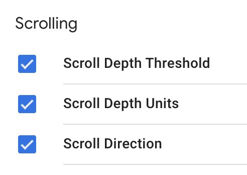
Go to the Variables tab in Tag Manager and click on the ‘Configure’ button to the upper right. There is a section for Scrolling variables — check all three, then click out of the Configure tab. You don’t need to save; your changes will save automatically.
step 2: create a scroll depth trigger
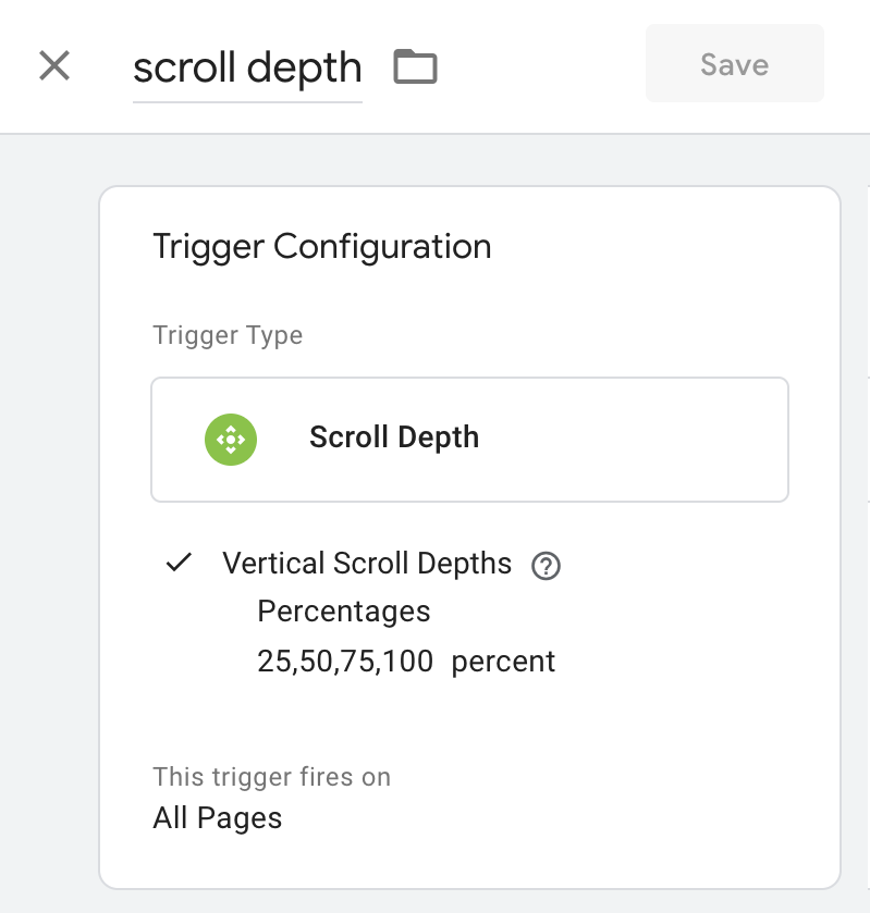
Next, go to the Triggers tab and create a Scroll Depth trigger with vertical scroll depths set at 25, 50, 75, and 100 percent.
step 3: create a GA4 scroll event tag
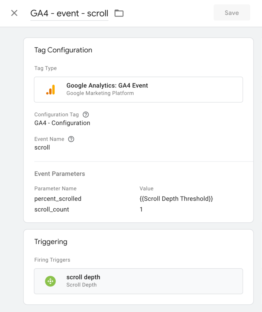
Next, go to the Tags tab and create a new GA4 Event tag with event name “scroll”. Add two parameters:
-
- percent_scrolled with value {{Scroll Depth Threshold}} — this will dynamically populate with the user’s scroll percentages when the scroll depth trigger fires.
-
- scroll_count with value 1 — we’ll use this trigger to populate a custom ‘Scrolls’ metric in GA4
Add the scroll depth trigger you created and save the tag.
step 4: test the tag in Tag Assistant
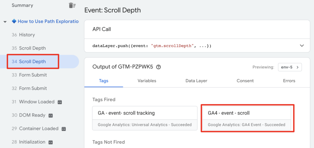
Click ‘Preview’ in the upper-right corner of Tag Manager to open Tag Assistant.
Open your site and scroll down the page.
Click back to the Tag Assistant tab. You should see Scroll Depth events on the left and your scroll event tag listed among the tags fired on the right. If you click on one of the Scroll Depth events on the left, then click on your tag on the right, you should be able to verify that the percent_scrolled and scroll_count parameters populated with appropriate values.
If all looks good, go back to Tag Manager and click Submit to publish your new tag! If all does not look good, make sure you followed the steps correctly. I’ve encountered a few websites where the scroll depth trigger doesn’t work properly, and unfortunately there’s not a simple fix, so cross your fingers that yours is not one of those.
Step 5: disable the automatic scroll event in GA4
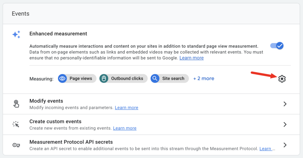
In GA4, click on the gear icon in the lower left to get to Admin, then click on Data Streams, then click on your Web data stream.
Click on the gear icon to the right of the list of automatic events to get to the config screen.
From there, you will see a toggle to the right of each event — click the toggle to the right of Scrolls to disable it. Make sure to hit ‘Save’ to save the change before leaving.
When you’ve done that, exit out of the data stream and Admin and click on Reports on the left nav, then click on Realtime. You should see ‘scroll’ in the ‘Event count by Event name’ widget if there are any active users on your site. You can click on the scroll event to see the parameters that are populating. If you see the scroll_count parameter, you know your custom scroll event is working and data is flowing through to GA4. Unfortunately, you will have to wait until tomorrow for the data to be available in Explorations.
step 6: set up the custom definitions in GA4
Click on Custom Definitions in GA4 Admin.
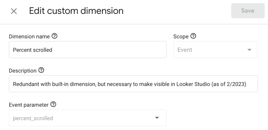
First, you’re going to create a custom dimension for Percent scrolled, with dimension name ‘Percent scrolled’ and the Event parameter ‘percent_scrolled’. Make sure the scope of the dimension is ‘Event’.
There is a pre-existing Percent scrolled dimension, but as of today, it’s not yet available in Looker Studio (whereas custom dimensions are). Before you create this, you may want to double check whether Looker Studio has started importing the built-in dimension, because Google has been gradually adding support for additional dimensions over time.
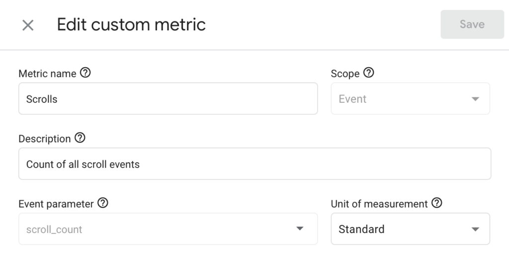
Next, click to Custom metrics and click the ‘Create custom metrics’ button to add the Scrolls metric.
Name the metric ‘Scrolls’ and set Event parameter to ‘scroll_count’. Also make sure the Scope of the metric is ‘Event’.
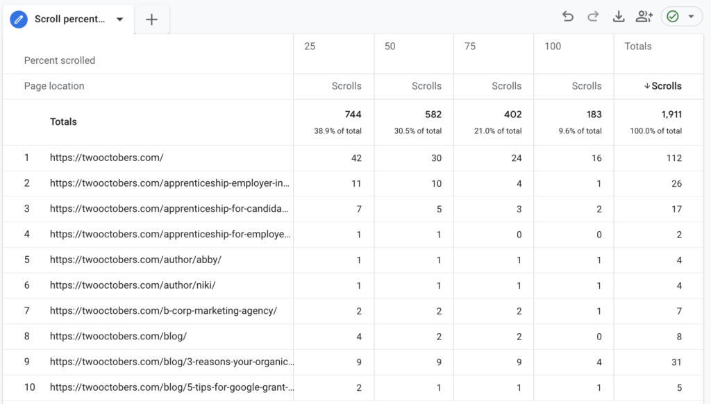
Building a looker Studio dashboard with percentages
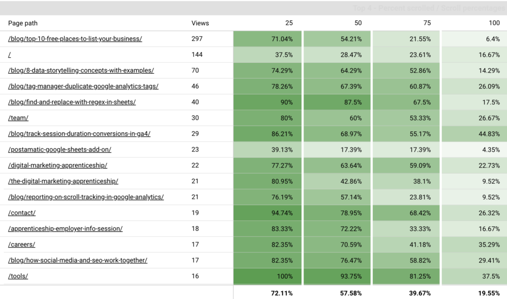
The finished product
The chart below is the glorious outcome of the customized scroll event you just set up. It shows heatmapped values for the percentages of users who scrolled various lengths down the page. I love how it gives us the ability to quickly identify blog posts that outperform and underperform in terms of engagement!
Below I describe the steps to build this dashboard — we’ll get in to some pretty advanced Looker Studio techniques, such as blends, calculated metrics and the Extract Data data source. We’ll also do a bit of wizardry on the presentation.
I recommend that you wait a few days after setting up the custom scroll event before doing this part, so you have a bit of data to populate your chart.
Setting up the Extract Data source in Looker Studio
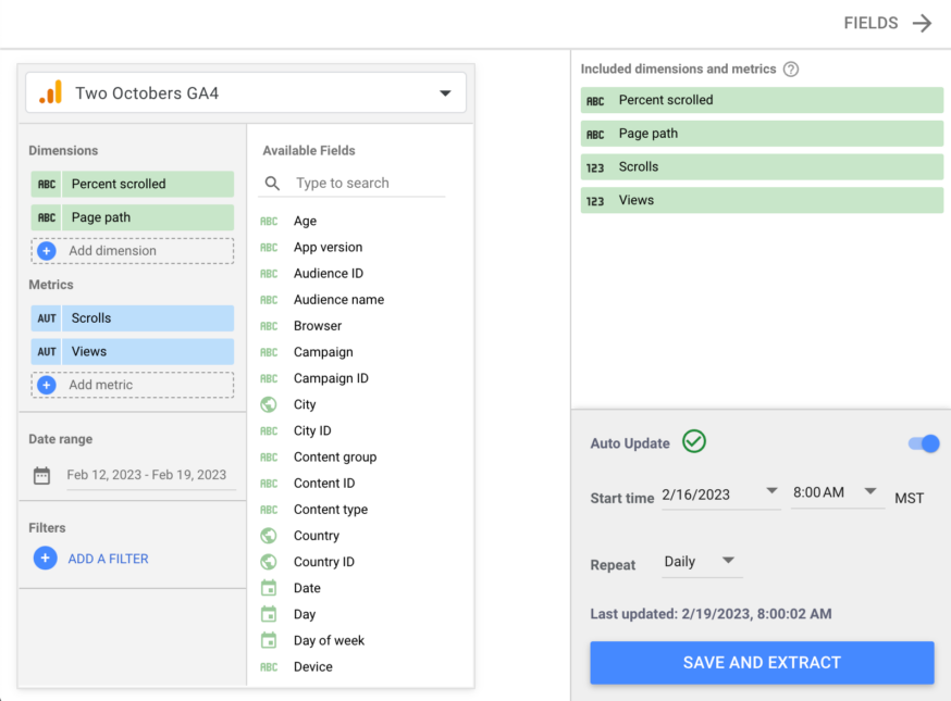
The first step is to set up an Extract Data data source in Looker Studio that pulls in the dimensions and metrics we will need to build the chart. The Extract Data connector pulls in data from a data source and caches it, and can be scheduled to do this once per data.
The reason we can’t connect directly to GA4 as a data source is because we’re going to use the Views metric as a dimension in the pivot table, and for some reason, Looker doesn’t like that with a GA4 direct connection. An added benefit of using Extract Data is that it circumvents GA4 API quota issues that can make connecting to GA4 directly untenable.
To set up the data source go to Resource > Manage added data sources and click ‘ADD A DATA SOURCE’. Select the Google connector Extract Data and select the dimensions ‘Percent scrolled’ and ‘Page path’ and the metrics ‘Scrolls’ and ‘Views’.
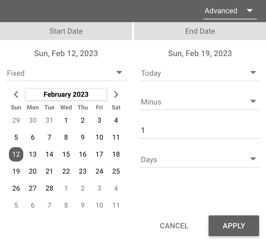
For date range, my recommendation is to pick a fixed Start Date that matches when you set up the custom scroll event. There’s no point in going farther back than that since there won’t be any data. Then set the End Date to Today minus 1 day. Also make sure to enable Auto Update in the lower right. With auto update enabled and the dynamic end date, your data source will automatically refresh every day.
Once you’ve got it all configured, click ‘SAVE AND EXTRACT’ in the lower right, then ‘DONE’ in the upper right to return to your dashboard.
Creating a blend
The next step is to create a self-blend of the Extract Data source. We need a blend because we’re going to be creating a calculated field that divides scrolls by views for each Percent scrolled amount. In other words, what percentage of people who view a page scroll 25%, 50%, etc. down the page?
In GA4 Scroll Tracking: Part 2, I show a shortcut on how to create a blend, but I’ll explain the standard way here.
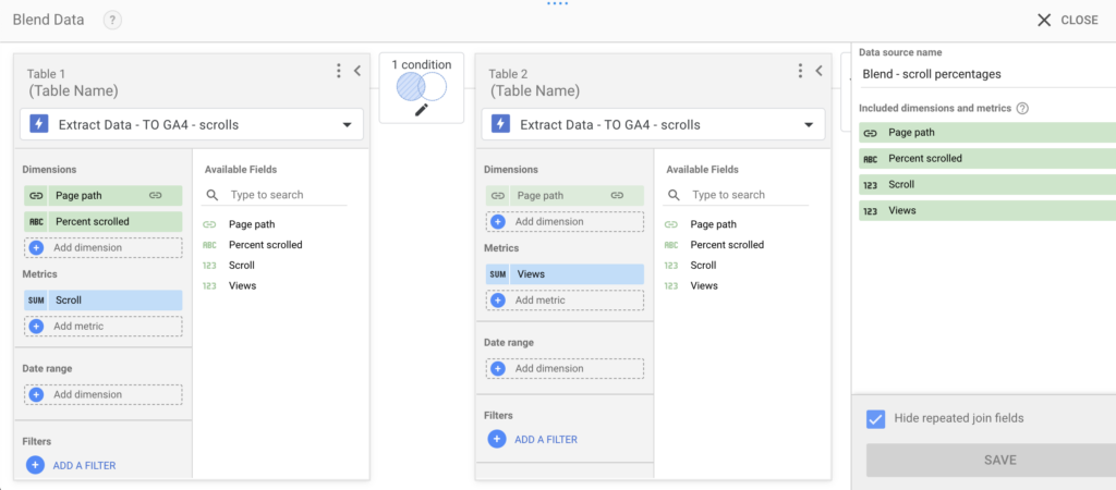
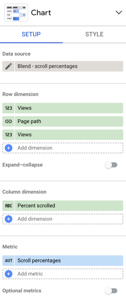
Go to Resource > Manage blends and click ‘ADD A BLEND’ at the bottom. Pick the Extract Data data source you just created for Table 1, and the same source for Table 2, as pictured to the right. Configure the join between the two tables as a left-outer join on Page path. On the left table add Percent scrolled as a dimension, and Scroll as a metric. On the right table add Views as a metric. Below is what your blend should look like when done.
Understanding the left outer join
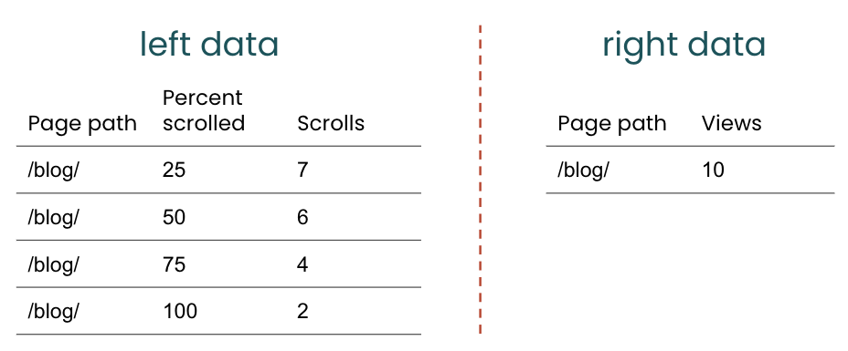
Before the join, the left data has one row for each combination of Page path and Percent scrolled, since those are the two dimensions in the dataset. The right data has one row for each value of page path. In the example to the right, there’s only one page path, but of course the real data will have many different page paths. In a left outer join, the joined dataset will include one row for every row on the left, and will join in values from the right when there is a row in the right with a join dimension that matches the left. If no match is found on the right, the columns that come from the right will be empty (null) for that row. Since we’re joining a dataset to itself, there will always be matching values for page path on the right. In general, however, a left join ensures that there will always be one and only one joined row for each row on the left.
What’s tricky about this join is that we actually want each row on the right to match more than once, because the total number of page views for a given page path doesn’t change as a function of how many visitors scrolled down the page.
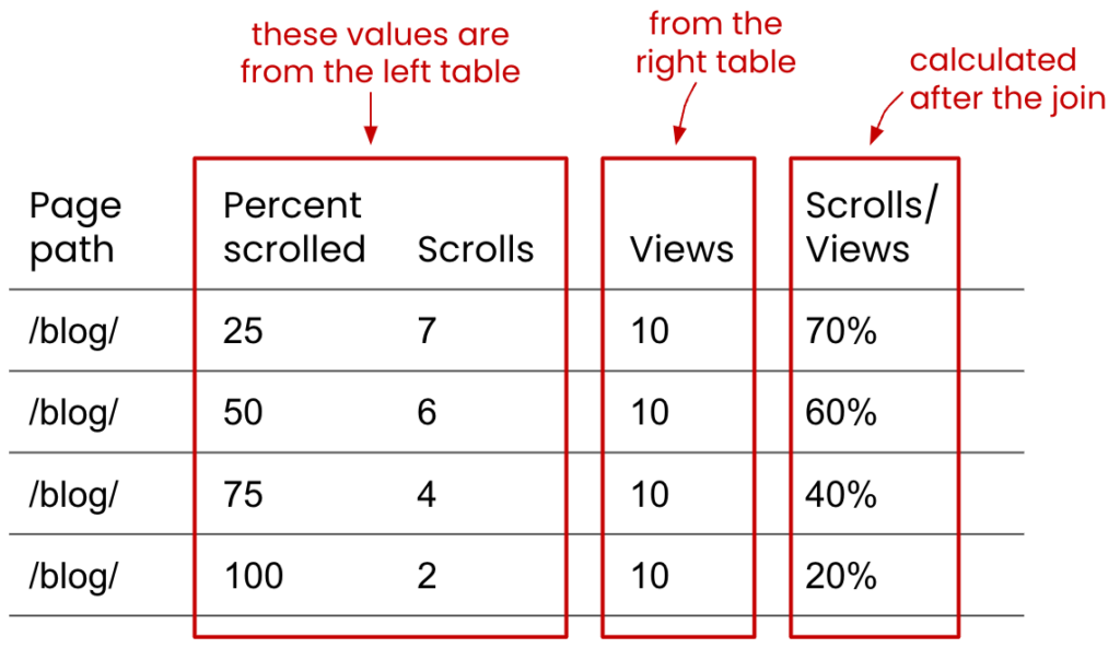
In the diagram to the right, you can see how the value for Views is populating multiple times, since there is one Views value for Page path on the right for multiple values of Page path & Percent scrolled on the left. I am also showing the Scrolls / Views metric, which is the whole point of this join.
Blends are a pretty complicated and confusing topic. Google does a pretty good job of explaining how blends work in Looker Studio if you’d like to learn more. Even if you feel like you understand blends pretty well, it’s always a good idea to spot check values that result from a blend to make sure it’s doing what you want it to.
configuring the pivot table
Once you’ve saved and closed the blend, insert a pivot table into your dashboard and connect it to the blended data.
Set the row dimension to Page path — it may have defaulted to this, but if it didn’t, click on the row dimension to replace it.
Set the column dimension to Percent scrolled.
Then, click on the Metric to replace it with a calculated field. Calculated fields give us the ability to create custom dimensions and metrics that are based on formulae applied to existing dimensions and metrics. This is exactly what we need in this case — we want the ratio of scrolls X percent down the page compared to the total number of page views.
For more on calculated fields, check out the Google Support article on calculated fields.
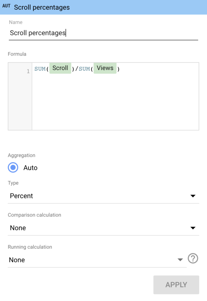
To create the calculated field, select the ‘CREATE FIELD’ option below the list of metrics, pictured to the right.
Name your calculated field ‘Scroll percentages’ and set the formula to SUM(Scroll)/SUM(Views).
Change the Type of the metric to Numeric > Percent and apply.
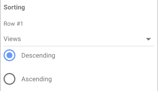
The next thing we’re going to do is…kind of weird. So far, you’re probably noticing that the sort order of rows is not very helpful. To solve this, we’re going to add Views as a dimension before Page path. It should default to show the page with the most views first, descending from there. If it doesn’t, find the Sorting config on the pane to the right and set Row #1 to Views, Descending.
It doesn’t look right to have views to the left of page path, so we’re going to add it as a dimension again below Page path. In other words, your row dimensions should be Views, Page Path, and Views. Weird, right? It would be nice if Looker Studio gave us the ability to pick the row dimension we want to sort on, but unfortunately, it doesn’t — so this sneaky trick will have to do.
Tip: To hide the left column, mask it with a rectangle that matches your background.
A few more settings:
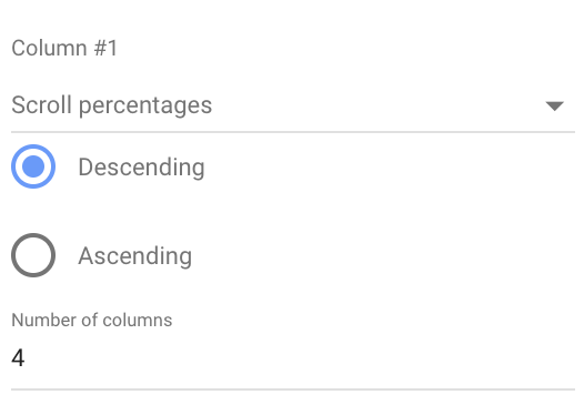
Set column #1 to Scroll percentages and sort descending — this will ensure that the order of the columns is correct, e.g. 25%, 50%, 75%, and 100%.
Set the number of columns to 4 — this will remove the (not set) column to the right.
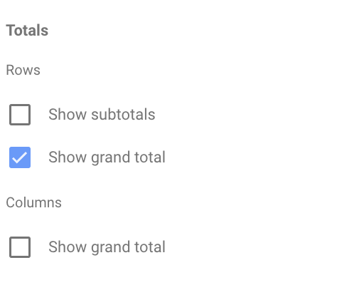
Enable Show grand total to see scroll percentages for your site as a whole.
finishing up
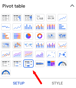
Your data should now be laid out about right. The last steps are to get it looking nice. To heatmap the Scroll percentages, click on Chart at the top of the pane to the right of your dashboard. This will bring up a variety of chart options, including several types of pivot tables. Click on ‘Pivot table with heat map’ to change it.
It will likely default to a blue heatmap. You can change this on the Style pane — scroll down and you’ll see a paint bucket below Metric #1. My personal preference is green.
I don’t care for the way Looker Studio titles pivot tables. As far as I know, there’s no way to turn this off, but I changed the table header font to match the background, which accomplishes the same thing.
Since pivot tables aren’t sortable, you may also want to add a drop-drown list or advanced filter so users can find specific pages.
If your pivot table isn’t looking right, make sure that the row and column dimensions look like this and that you’ve followed all of the steps in this post or the videos.
FAQs
How does Google Analytics track scroll depth?
GA4 features default scroll tracking that works without you needing to set anything up. GA4’s default scroll tracking only fires when a users scrolls 90% down the page. You can also use Google Tag Manager to create custom scroll tracking that fires at other thresholds like 25%, 50%, 75%, etc.
What is a good average scroll depth?
When analyzing a group of related pages, 50-75% average scroll depth typically indicates solid user interaction with a page. It’s better to evaluate a group of related pages rather than a whole site, because pages can vary in content length, design, and purpose.
How do I use scroll depth data to improve the user experience on my website?
The default GA4 scroll tracking feature may not be extremely helpful in most cases, as it only fires when a user reaches the 90% mark. Setting up custom scroll tracking at multiple depths is more helpful, because you can better approximate where the user is dropping off, then look at the live page to determine why that might have happened. For example, if the average scroll depth for long form piece of content is only 25%, take a look at the page and see if there are possible points of friction, like a wall of dense text, a pop up, or a slowly loading video element. Once you have an idea of what might be causing users to stop scrolling you can start addressing it.![]()
Looker Studio can be fussy, so have no fear if something’s not working. Reach out to me and I’ll see if I can help. Happy analyzing!