How to Create a Pie Chart of GA4 New vs. Returning Users in Looker Studio

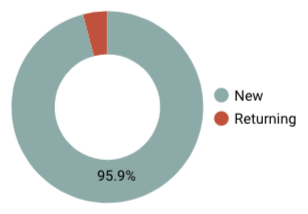
In this post, we will describe how to create a chart like the one below using GA4 data in Looker Studio. Along the way, we will explore what ‘new vs. returning’ means in GA4–spoiler alert, it’s a bit messy. So we’ll also look at a different way of making the calculation that makes more sense for a donut chart. It uses powerful technique in Looker Studio that includes a blend with a full-outer join and the crafty COALESCE() function to transform the data into the format we need.

ga4 new vs returning users pie chart

Watch the video to see a detailed walkthrough of all of the steps outlined in this post.

How GA4 calculates returning users

Google defines a New user in GA4 as:

(the) Number of users who interacted with your site or launched your app for the first time

The metric is measured by the number of new unique user IDs that logged the first_open or first_visit event.

What that means is that a “New user” has never been to the site before the reporting timeframe. Therefore, you would think that a returning user is a user who has been to the site before the reporting timeframe. But when you compare the sum of New and Returning users, it actually exceeds the count of Users by quite a bit. Google does not define Returning users in the GA4 reporting interface, but this is how the ‘New / returning’ dimension is defined in Looker Studio:

New users have 0 previous sessions, and returning users have 1 or more previous sessions. This dimension returns two values: ‘new’ or ‘returning’.

Given the fact that New users + Returning users > Users, we know that the “previous sessions” could have occurred within the reporting timeframe, resulting in the same user being counted twice. But I’ve done the math, and that is not sufficient to explain the discrepancy between Users and New users + Returning users. 

In the video, I show a case where Active users – New users = 642. In the same timeframe, the New / returning dimension shows 3,078 Returning users. That can’t be accounted for just by counting the same users twice.

Given the discrepancy, I think Google’s metric may better be described as ‘Returning user sessions’, but I can’t say for sure. In any case, I know I don’t like it. What I want to know when I’m reporting on New vs. Returning users is what percentage of users in a given reporting window are brand new versus users that have visited before – i.e a user is either new or returning, not both.

The math for that calculation is simple. Google’s definition of a New user matches what I want, so I know how many users have visited before by subtracting New users from Users:

Users – New users = Returning users 

We are going to use this method to calculate returning users in the second version of the donut chart we create. But first, let’s create a version using Google’s dimension.

Creating a donut chart using Google's dimension

While I prefer my method of calculating returning users, it’s quite a bit easier to create the chart with GA4’s built-in dimension, so we’ll start there. Keep in mind though that the resulting donut chart shows many of the same users in both slices, which is not how we typically think of donut/pie charts.

To create the chart:

  1. Insert a donut or pie chart into your dashboard
  2. Select your GA4 data source
  3. Select ‘New / returning’ as your dimension
  4. Select ‘Active users’ as your metric – this is equivalent to ‘Users’ in GA4 reporting
  5. Add a filter to exclude ‘New / returning’ = (not set) – I show how to do this in the video if you are not sure.

That’s it! Watch the video for a detailed walkthrough.

Creating a donut chart using a custom dimension

In this version, we’ll use my method of calculating Returning users:

Users – New users = Returning users 

Step 1: creating a blend

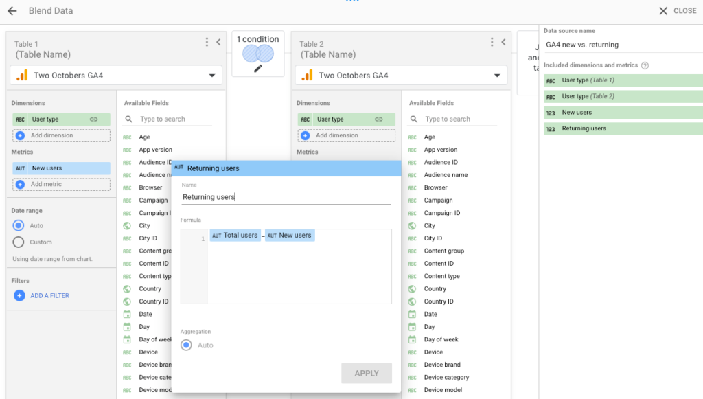
A blend is a method of joining two data sources, based on one or more common dimensions. For the purpose of reporting on new vs. returning users with our custom calculation (Returning users = Users – New users), we join a GA4 data source to the same GA4 data source. 

  1. In Looker Studio, go to Resource > Manage blends > Add a blend.
  2. Select GA4 as the data source for Table 1. (If you don’t already have a GA4 data source in your dashboard, you’ll need to add one first.)
  3. Click ‘Join another table’ to add Table 2. Select GA4 as the data source for this table as well.
  4. Both tables will probably have defaulted to include the dimension Event name.  Remove these, then click Add dimension > CREATE FIELD. 
  5. Name the field “User type” and set the formula to “New” on Table 1 and “Returning” on Table 2. 
  6. Add New users as a metric to Table 1.
  7. In Table 2, select Add metric > CREATE FIELD and name the field “Returning users” and set the formula to Total users – New users.
  8. Lastly, click Configure join, and select Full outer join. This will return the values from Table 1 and Table 2, in spite of the fact that the values for User type don’t match.
  9. Name the blend something you’ll remember, like “GA4 new vs returning users” and save.

looker studio blend for new vs returning users pie chart

Step 2: the COALESCE() function

We are almost ready to create our pie chart, but there’s still one problem. A Looker Studio full outer join creates a dataset with holes in it. If you could look at the raw data in your blended data source (wouldn’t that be nice?), it would look something like this:

User type (left table) User type (right table) New users Returning users
Sample #1 Row 1, Content 1 Row 1, Content 2 Row 3, Content 1
Sample #2 Row 2, Content 1 Row 2, Content 2 Sample #3

But to create the pie chart, we need it to look like this:

Sample ID Heading 1
Sample #1 Row 1, Content 1
Sample #2 Row 2, Content 1

This is where the magical coalesce function comes in. Looker Studio’s coalesce function returns the first non-missing value found in a list of fields. 

We use this function to take the two columns for user type and combine them into a single column. Because the User type dimension from the left table never has values when the User type from the right table does, and vice versa, this function effectively combines the data into one column. We’ll use the same trick to combine New users and Returning users into a single column and voilá, we have what we need for a pie chart!

User type Users
COALESCE( User type left, User type right) COALESCE(New users, Returning users)

Step 3: creating the donut chart

  1. Insert a pie chart into your dashboard and select the blend you just created as the data source.
  2. Remove the default dimension and select CREATE FIELD. Name your custom dimension “User type” and give it the following formula:
    
     COALESCE(New, Returning)
    
   
  1. Then remove the default metric and select CREATE FIELD.  Name your custom metric “Users” and give it the following formula:
    
     COALESCE(New users, Returning users)


Note that the inputs used in your formula will be based on the names you’ve set in previous steps, so if you used different names, adjust your coalesce functions accordingly. 

I’ve tried to cover all of the important steps in this post, but I haven’t described every mouse click. If you need more detail, I recommend watching the video.

Limitations of New vs. Returning Users in GA4

With regards to user metrics in Google Analytics, there are some things to keep in mind. 

For one, the primary means of identifying a user is based on cookies. This means that if you visit a website on multiple devices or with different browsers, you will likely appear as several different users. Additionally, if you clear cookies or use an ad blocker, GA will treat you as a new user. Both of these result in over-counting users and incorrectly categorizing them as new, even if they’ve been to the website before.

GA4 is actually designed to identify users from more than just the cookie that identifies them for Google Analytics, through a feature called “reporting identity.” It uses multiple types of identity data, including Google signals, device ID, and modeling based on similar users. But in practice, at least as of now, this doesn’t appear to affect new vs. returning user data much.

In general, the proliferation of internet-connected devices and the strengthening of browser privacy features means that users are getting harder to track. Think of any user-based metric as directionally useful, but take it with a grain of salt.

Second, a high percentage of new users isn’t inherently good or bad. It depends on the question you’re trying to answer. If you’re trying to acquire new customers through advertising, then a high percentage of new users could be beneficial. However, returning users may indicate that you are attracting interested prospects. It’s rarely a clear-cut decision, and the context of the situation matters.

FAQs

What’s the difference between new and returning users in GA4?

New users are visiting your site for the first time. Returning users have visited your site before, but the returning users metric counts the same user more than once, so “users” is somewhat misleading. GA4 is designed to do a better job than Universal Analytics in identifying users across multiple sessions and devices through Reporting Identity features, so theoretically it should have more accurate returning user data. In practice we haven’t seen much improvement, and changes in user behavior and privacy concerns may offset any gains.

How do I check new or returning users in GA4?

Find new and returning user data in the Retention report in the Reports section of GA4.
‘Returning users’ is not available as a metric in Explorations (as of this writing), nor is there an equivalent dimension. There is a ‘New / established’ dimension in Explorations, but that is defined as “New users first opened your app or visited your website within the last 7 days. Established users first opened the app or visited the website more than 7 days ago,” which is totally different from how “New users” is defined in GA4 reporting.

gold lines expanding outward

Learn more about GA4 reporting in Looker Studio in our tutorials, including how to report on individual GA4 conversions in Looker Studio and how to create a GA4 scroll tracking report in Looker Studio

Two Octobers upskills digital marketers of all skill levels. Check out our GA4 and Looker Studio small-group training program.

Share This Post

Share This Post

master GA4

with personalized training

A training program like no other. Work with expert marketers for 1:1 training to maximize learning & impact.

have you registered?

Our next free digital marketing seminar is coming soon!

[MEC id="946"]