Blends are one of the most powerful features of Looker Studio, but they’re a little tricky to get your head around. In this blog and the video below, I’ll review some of the different types of blends that you can create in Looker Studio and the gotchas with blends that you’ll likely run into. I’ll cover the three most common blend types used in Looker Studio: left outer joins, inner joins, and full outer joins. Finally, I’ll share several visualizations that use blends that we’ve used in our marketing dashboards.
What can you do with a blend?
You can use blends to bring together all sorts of marketing data. You can consolidate data from different sources, for example:
- Add cost data from advertising platforms to traffic data from GA4.
- Combine cost, impression, and click data from multiple ad platforms like Microsoft Ads, Meta, etc.
You can also use blends to combine different types of data based on the same source. This is useful when you want to display a list from a data source (like a list of web pages) with some calculated data from the same data source. Examples include:
- Use GA data to display a list of web pages plus the scroll depth for each page.
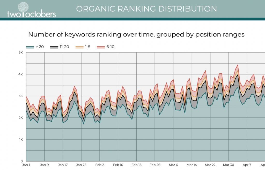
- Take keyword ranking data and put it into buckets, for example ranking 1-10, 11-20, etc., and chart the number of keywords that rank in each bucket over time.
Scroll to the end of the post for more examples with links to step-by-step instructions of reports that leverage blends.
The blog below shares the steps to work with blends, and I walk through the same steps in this video.
In this video:
00:00 Introduction to blends in Looker Studio
01:31 The sample data
03:11 Left outer & right outer joins
10:35 Inner joins
12:06 Full outer joins
Follow along with the sample Looker Studio dashboard and the Google Sheet with sample data. You’ll need to make copies of both and reconnect your data sources to your Google Sheets copy to create your own editable dashboard.
Let’s Get Started
We’ll start with a sample data set in Google Sheets that looks like this.
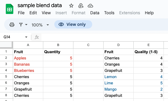
I’ve changed the color of the text on the left table to red for the fruit types that are not on the right table and color coded the fruits on the right table that are not in the left table to blue, just to make it a little easier to see which fruits are in common between both sides.
Create a data source from a Google Sheet in Looker Studio
Let’s start by connecting Looker Studio to your data source, a Google Sheet.
- Open Looker Studio.
- Go to “Resources” on the top bar.
- “+ Add a Data Source”.
- Select “Google Sheets”.
- Search for and select the name of the Google Sheet you want to connect with. Then select the worksheet to use.
- One of your options is to “Include specific range”–you don’t have to select the entire worksheet. Select the first dataset range, which in this example is A1:B8. Click “Add”.
- Rename this data set. Go to the Resource menu and select “Manage added data sources”. Click edit on the line for your data source. In the upper left, replace “sample blend data – sample data” with “sample data – left”, and click “Done”.
- Repeat these steps to create a second data source from the same sheet, using the dataset range D1:E8 and renaming it “sample data – right”.
- Add the data table to your dashboard. If this was a brand new dashboard, Looker Studio automatically added a table after you connected to your first (left) data source, and you’ll need to add a table for the second (right) data source. Go to the Insert menu and select “Table”, then confirm the data source is correct by looking in the Chart column.
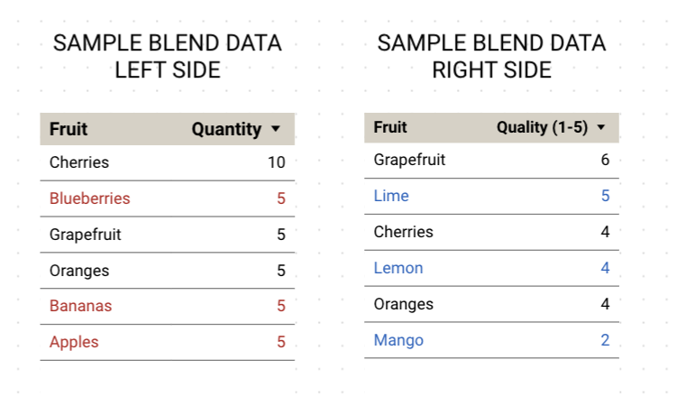
- If necessary, change the Dimensions of each table to “Fruit” and the Metrics to “Quantity”, so your tables look like these:
Understanding Left and Right Outer Blends
Let’s look at how left and right outer blends work. We’re going to start by creating a blend.
Create a Blend
You could create a blend by going up to the Resource menu and selecting “Manage blends”. We’ll do it another way:
- Select the table on the left, then hold down the shift key while selecting the table on the right.
- Right click and scroll all the way to the bottom to select “Blend Data”.
The default chart shows Quantity as the column labels, weirdly, so change the Dimension to “Fruit”, and include both “Quantity” and “Quality (1-5)” under Metric.
Configure the Blend
Let’s look at the configuration of the blend.
In the Chart properties column, under Data source, click the pencil icon next to “Blended Data”. You’ll see the data we set up on the left and the data we set up on the right.
Click on the “1 Condition” box. This window shows the different ways that we can combine that data in a Looker Studio blend. The word “condition” here refers to the join condition. A join condition is a term that comes from SQL, and describes how you want the data to be combined when you’re combining two tables of data.
What is an Outer Join?
The default selection is “Left Outer”, which Google describes, “returns matching rows from the right table plus non matching rows from the left table”
What does that mean? In a left join, the blend will return matching and non-matching rows from the left table (meaning it’s going to return all rows from the left table) and only matching rows from the right table.
A right outer join is exactly the same thing, but it will “return matching rows from the left table plus non matching rows from the right table”. So it’s the inverse of what a left outer join does.
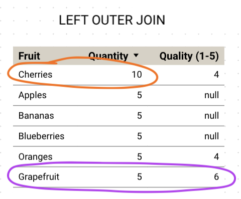
How Data is Blended in a Left Outer Join
Now let’s have a look at the data in the left outer join.
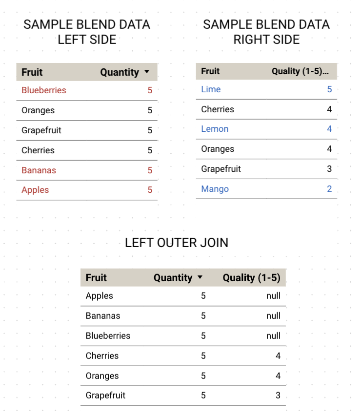
The left table shows we have cherries, grapefruit, and oranges. But blueberries, bananas and apples are only in the right table. The blended data table has a quantity for all fruits, because there are values for quantity in all rows in the left table. But it only got quality for the fruits that matched in the right table. It returned null values for rows in the left table that don’t have a corresponding quality value in the right table.
Expanding the Data Set to Include Multiple Rows of Values
Now, let’s play around with this data a little bit. Right now we don’t have to deal with situations where there might be two rows of the same data–two rows of the same fruit. So let’s change that.
- Go to your Google Sheets data.
- Add another row for “Cherries” in the first table with 5 for quantity.
- Then add another row for “Grapefruit” in the second table with a 3 for quality.
- Go back to the table in Looker Studio, and refresh the data in your dashboard. In the upper right next to the “View” button, select the three dots menu and “Refresh the Data”.
Now what did Looker Studio do? It took cherries, and it did what we want it to do, which is that it doubled the quantity. In the case of grapefruit, it doubled the quality. But that’s not actually what we want there.
Let’s fix how the data is aggregating on the right table in the blend.
- Click on the table with the blend.
- Under Chart > Setup select the pencil next to “Blended Data”
- On the right table the Metric “Quantity” is aggregated by SUM. Click on SUM to change the aggregation method to “Average”.
- “Save” that, close and refresh data.
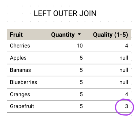
This is one common gotcha. Pay attention to how Looker Studio aggregates values in your blend to make sure you get the values that you want.
Expanding the Data Set to Include Multiple Columns of Data
One other circumstance I want to look at is when you have more than one dimension in either your left or your right table.
In the sample data set, on the second tab named “more sample data”, you’ll see each table has a column added for color.
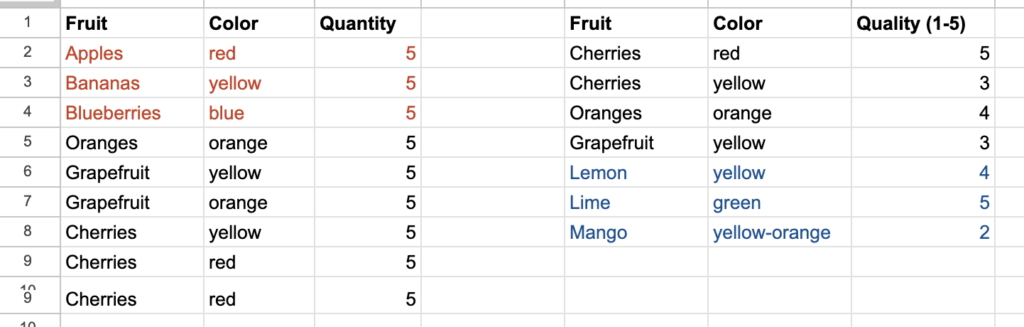
In the second tab of the sample dashboard named “Blend – duplicate rows”, there is a Data Source that connects to each of these.
Let’s create a blend from these two tables
- Select both tables, right click and select “Blend Data”
- Under Chart > Setup, modify the dimensions so there are two: Fruit and Color.
- Modify the Metrics to show Quantity and Quality
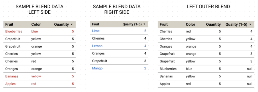
Here’s another gotcha. There’s a problem with the data that’s common when creating a blend where rows have multiple dimensions. In our source data, the red cherries have a quality of 5, while the yellow cherries have a quality of 3. In the table we just created for the blend, those values are being averaged to 4.
Because the right table wasn’t showing the color dimensions (even though the underlying data does include the color column), Looker Studio created a blend and joined using only the fruit column/dimension.
Let’s adjust that.
- Under Chart > Data source, click the pencil next to Blended Data.
- In the right table, add Color to the Dimensions.
- Then click on the “1 condition” box which brings up the Join configuration window. Under Join conditions, in the second row, add color on the left, and it will automatically add color on the right.
This is such a common gotcha in a circumstance where you’ve got dimensions on your left, dimensions on your right, and your metrics aren’t aggregating the way that you want them to. It is often because you need to have the dimensions that make a row unique in both tables that you’re blending together, and then make sure that those dimensions are used in the blend’s join conditions.
Understanding Inner Joins
Let’s return to our first set of sample data.
In the left outer join blend, because blueberries, bananas and apples don’t exist in the right side data, those rows show null values for Quality.
What happens if we change this to an inner join? Google says an inner join “returns only matching rows from the left and right table.” You can see how this works by changing the blend configuration for this table.
- Click on the table, then under Chart > Setup, select the pencil icon next to the Data source “Blended Data”.
- Click the “1 Condition” box between your two table configurations.
- Select “Inner”, then Save and close.
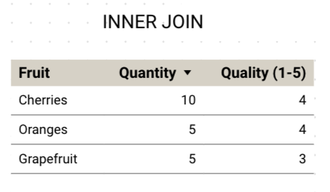
Now all it’s showing us are the rows of fruit values that exist in both tables. You would choose an inner join over a left outer join in cases where you only want to see data with values in both tables, for example you are only interested in the fruit that you know both the quantity and the quality for.
The gotchas I described in the previous section apply here as well. If you have multiple dimension columns that really define the uniqueness for a row of data, you need to make sure to include those dimensions in your join condition, exactly the way you would with a left blend.
Understanding Full Outer Join
A full outer join “returns all rows from the left tables, and right tables, whether they match or not.” Change your table so that it’s using a full outer join.
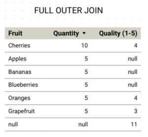
What happened to limes, lemons and mangoes? Weirdly, the quality value for lime (5), lemon (4), and mango (2) is summed up under this “null” line.
If you look under the Chart column on the right, you’ll see the Dimension listed is Fruit (Table 1), meaning it’s taking the dimension from the left table–it’s treating fruit in one table as a separate dimension from fruit in the second table.
So how are we going to deal with this? We’re actually going to create a custom field to solve this problem. The custom field will blend the Fruit dimension from both table 1 and 2.
- Under Chart, click “Add dimension” and select “Create field”.
- Name it “Fruit”.
- In the Formula area, type in:
The Coalesce() function returns the first value that is not null from a list of values.
- Click Apply.
- Delete the original dimension (Fruit (Table 1)).
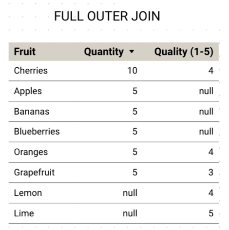
This looks better. In cases where the fruit exists in both tables, we see there’s values for both quantity and quality. The fruits that exist on the left and not the right, we get quantity for but not quality, and vice versa: the fruits that exist on the right and not the left we’re getting these values for.
Does Anyone Really Use Cross Join?
Cross join “returns every possible combination of rows from the left and right tables”. It’s just pandemonium! I have never needed to use a cross join in a Looker Studio dashboard. If you come up with a reason why it’s useful, I’d love to hear.
Add Up to 5 Data Sources
With blends, you could join yet another table of data…and keep going. You can add up to five tables to join together.
Examples of Blended Data in Looker Studio
There are so many ways blends are useful in Looker Studio, and I’ve recorded a lot of videos that leverage blends for marketing data visualizations. Take a look at the examples below, which all contain step-by-step instructions on how to create charts and graphs leveraging blended data.
- Keyword ranking distribution
- Reporting on specific GA4 conversion events
- User scroll percentages by page
- Organic vs. paid keyword gap analysis
- Trending keyword reporting
- New vs. returning user percentages

At Two Octobers, we love working with GA4 and other forms of marketing data to create terrific data visualizations. We offer GA4 and Looker Studio training, as well as analytics & dashboard services for businesses of all kinds.